Showing posts with label art. Show all posts

Wednesday, June 25, 2008

Tiling Textures


Learning to turn non-tiling textures into ones that tile smoothly can be tricky, but there are some quick techniques that you can use, and a few things to avoid along the way.

The goal of a tiling texture is its ability to be repeated over a flat surface, or wrap around a 3D surface, without drawing attention to itself. It is grass we are supposed to be walking on, not a carpet with a noticeable pattern on it. A good way to think of tiling textures is as a bit player in a movie. The star of our movie is the model itself, we don’t want any supporting element to draw attention to itself and way from the overall effect we are trying to achieve.

In this example you can see a texture that actually tiles quite nicely. The only problem is that it includes several bricks that stand out and draw attention to away from the others. This is like having a crowd of extras include one or two guys frantically waving their arms and upstaging the other performers. The human eye is attuned to looking for patterns and a wall made with this texture will only reinforce the fact that the wall in your 3D environment is a texture and not actually made of bricks.

Here is a quick trick for turning a less contrast-y texture into a tiling texture. This dirt/stone texture is pretty nice, and fairly subtle, but I want to have it used over a larger area than just the dimensions of this one texture.

In Photoshop’s Filter/Other/Offset I took this 256x256 texture and Offset it by 128 pixels both vertically and horizontally. This allows me to see how all four edges meet. Using the Clone Stamp Tool and a rough edged brush shape, I grab elements from areas of the texture, away from these seams, and “stamp” them over the hard edges.

I am also trying to avoid making really obvious repeats so I might do a lot of stamping to retain an organic and random appearance. Remember, I am not trying to preserve the texture, but I am trying to remain true to its organic origins. When I am done I apply Offset again to see what my texture looks like now that it is tile-able.

In the case of the brick texture at the beginning, I have spent a little more time on it than on the dirt/stone texture in the previous example. In this case I have chosen separate bricks and used the Stamp Tool to sample textures from some of their less attention-seeking neighbors. As you can see I have retained a lot of the essence of the texture, but made it much better for using in larger tiled areas.

One final note: If I were to use the above texture I would probably de-saturate it even more, removing some of the temperature differences between the warm and cool bricks. I might even choose to make it a black & white Grunge texture for use elsewhere. In the end the choice is up to you, and where it will eventually be applied will often dictate what choices are the best to make. Go give it a try!

Friday, June 6, 2008

Learning from the Best

In art school they tell you to get out into the world and observe. Only through observation and study do we become better at representing that world in our work. The funny thing is that we are creating art for virtual worlds, so what better place to observe than other virtual environments? One of my favorites is World of Warcraft, and when my son and I are playing it together he often complains that I spend more time “sniffing the daisies” then killing Orcs. I admit that I like to walkabout in computer games, but mostly I to try and figure out how they have created some of the beautiful effects and environments that seem to work so very well.

One such field trip took me to WoW's Iron Forge, where they have a splendid central steel mill filled with ore buckets pouring forth molten metal. I got to thinking how much fun it would be to try and integrate that into a furniture item, so I created the “Lava Throne”. Using a long 'lava” texture and an organic alpha map with irregular holes, I was able to map a continuous running stream pouring over the edges of the throne's miniature pools.


The real trick comes with Mapping the texture to the geometry. Since I wanted the molten flow to be thick and viscus at the top, then pull like taffy as it slowly oozed over the lip of the spout, I did some compressing of the mesh coordinates onto the Unwrapped texture. Once I animated the scrolling texture in the Previewer, I was able to get the effect I was looking for. Moving the coordinates for each stream gave them a random look, and avoided the telltale repeating pattern that can happen with tiled textures.

Monday, June 2, 2008

Developers Really “Get It”


Developing for virtual worlds can sometimes feel like you are filling out the contents of a Target catalog. It is easy to overlook the opportunity to really transport your audience into another world. One of the experiences I have from reading a book is that it invites me to rattle around in a parallel universe for a while, something I don't necessarily get from going to the movies or watching television. Virtual worlds have that same opportunity, but only a few have worked to push the envelope in that respect. A friend gifted me this IMVU Room and I have to say I am impress with the way they have promoted their virtual product. The video makes me want to go there, and better yet, to share the experience with someone else. ~Don


See it for yourself: Steampunk Towers


Sunday, June 1, 2008

Letting Your Textures Do a Lot of the Work

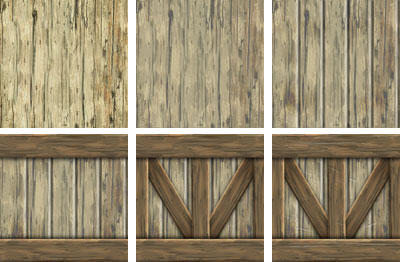
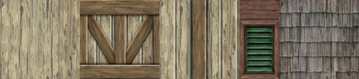
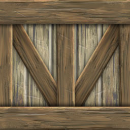
When I am working on a mesh, and I know that I will be creating several textures that will need to visually work together, I often start with the same base texture. In the above examples I start with a photograph of wood grain and soften it by running the Cutout Filter on it in Photoshop. Cutout turns photographic images into a more graphic image and has the effect of minimizing the contrast , giving a painterly quality to the image. I then add separations in the wood texture to suggest planks or individual boards. Next I copy and paste one of these boards to the top and bottom of my planks and darken them slightly. I repeat this to create the additional cross pieces, finally adding minor details and highlights to the surface to add interest and suggest the surface is weathered.

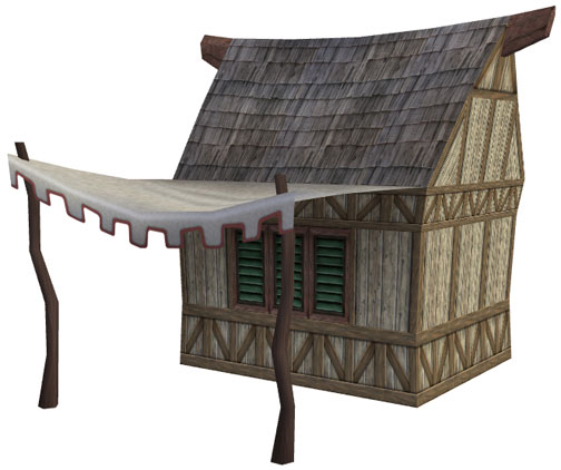
This technique allows me to build a variety of textures from the same base. Each of the above textures has it origin in my first Cutout wood grain texture. This also assures that there is a cohesive quality to all the textures, making my finished model look more believable.

As I have said before, texture creation is often the most time consuming aspect of 3D model building. The quality of the textures applied to your mesh will determine the quality of the finished product. I often create master versions of each texture at twice the size of the eventual finished file, which is where I do all of my finer details. In this example I have added nicks and scratches to help break up the more linear edges and suggest age. I personally like a more impressionistic approach when I create textures and find they often suggest more detail then is actually there. ~Don

Wednesday, May 14, 2008

Texture Tricks

I have a bunch of tricks that I use to help me when I need to create dramatic textures. I used one such trick on a recent model I created, a Mayan inspired skull idol. I knew that I needed to create a texture that has to fit perfectly to the geometry I have built, so I will render a gray version of my untextured mesh first. To do this, I will set 3D Max to do a Light Tracer or Radiosity rendering. This will create an elevation with subtle bounce light on the surface and also suggest where the shadows might land. I then use this rendering as the under drawing for my texture paint.

In the above example you can see the rough 3D mesh, then next to it my front view render of the same model. In Photoshop I place the rendering (1) at the bottom of my Layers stack and start building up from there. Next, I start to draw out more details in black & white (2) using the render as a guide. I try to soften the hard edges and deepen some of the shadows. Next, I tint the black & white drawing (3) with just enough color to add interest to the surface. Lastly, I place a Multiply layer with a strong granite texture over the top of the entire image (4). I then play with the opacity percentage of the layer to allow the under drawing and texture to come through while remaining influenced by the organic texture on top. I also take the time to really push the shadows to suggest more depth than is actually built into the model itself.


The mesh has a very loose and theatrical quality to it. There is no reason to go photo realistic, and sometimes just suggesting detail is more than enough to get your point across. ~Don


PS - You might notice that the final model is a little less symmetrical than the rough model. I often distort, taper, or even squash my models after they are textured to give them a less "mathematical" appearance.


Tuesday, May 6, 2008

Adding Drama To Your Products

There are a lot of special tricks that you can use to give the illusion that your 3D models have more detail and drama than just what your geometry and applied textures will allow. Here is just one of them...

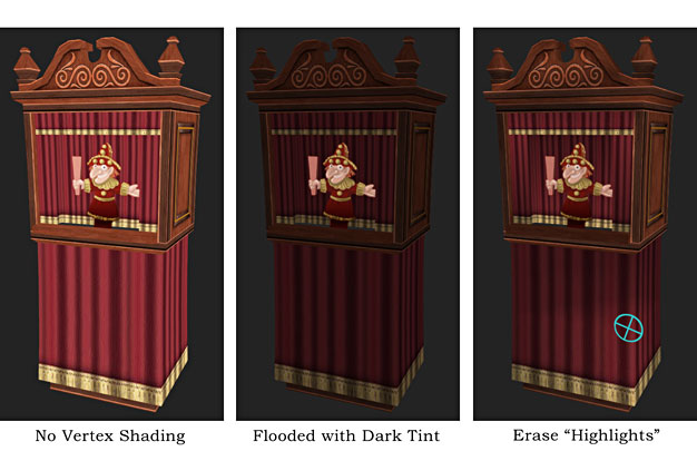
IMVU does not currently have a dynamic lighting system, so as content creaters we have to be a little cleaver about how we suggest mood and lighting in the products we create. One of my favorite tricks is to add depth to the surface of my models with Vertex Shading. Although the tool itself is a little like trying to decorate a cake with a hammer, this trick has given me some nice results.

In 3D Max I select the mesh I wish to shade and flood the entire surface with a darker tint. I then take the eraser tool and just ever so lightly pick out areas that help define the object's surface, allowing other areas to remain dark, and in the “shadows”. This trick does a nice job of turning an otherwise flat model into one with a little more theatrics. Still, it is possible to get a little too dark, so I suggest you take a light hand when shading your own creations.

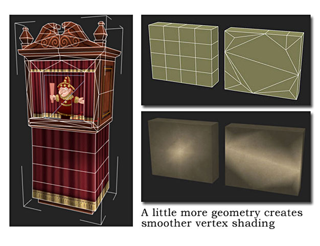
One other note. Vertex shading can get ugly fast if there is not enough geometry to help the transitions smoothly gradate across the surface of your model. To help alleviate this effect, I suggest you add just a little more geometry over large flat areas, and when in doubt use the blending tool to soften out any hard edges. It takes some time to get used to, but you will be happy at how much better your meshes look in the end. ~Don