Wednesday, June 25, 2008

Tiling Textures


Learning to turn non-tiling textures into ones that tile smoothly can be tricky, but there are some quick techniques that you can use, and a few things to avoid along the way.

The goal of a tiling texture is its ability to be repeated over a flat surface, or wrap around a 3D surface, without drawing attention to itself. It is grass we are supposed to be walking on, not a carpet with a noticeable pattern on it. A good way to think of tiling textures is as a bit player in a movie. The star of our movie is the model itself, we don’t want any supporting element to draw attention to itself and way from the overall effect we are trying to achieve.

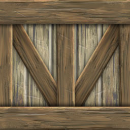
In this example you can see a texture that actually tiles quite nicely. The only problem is that it includes several bricks that stand out and draw attention to away from the others. This is like having a crowd of extras include one or two guys frantically waving their arms and upstaging the other performers. The human eye is attuned to looking for patterns and a wall made with this texture will only reinforce the fact that the wall in your 3D environment is a texture and not actually made of bricks.

Here is a quick trick for turning a less contrast-y texture into a tiling texture. This dirt/stone texture is pretty nice, and fairly subtle, but I want to have it used over a larger area than just the dimensions of this one texture.

In Photoshop’s Filter/Other/Offset I took this 256x256 texture and Offset it by 128 pixels both vertically and horizontally. This allows me to see how all four edges meet. Using the Clone Stamp Tool and a rough edged brush shape, I grab elements from areas of the texture, away from these seams, and “stamp” them over the hard edges.

I am also trying to avoid making really obvious repeats so I might do a lot of stamping to retain an organic and random appearance. Remember, I am not trying to preserve the texture, but I am trying to remain true to its organic origins. When I am done I apply Offset again to see what my texture looks like now that it is tile-able.

In the case of the brick texture at the beginning, I have spent a little more time on it than on the dirt/stone texture in the previous example. In this case I have chosen separate bricks and used the Stamp Tool to sample textures from some of their less attention-seeking neighbors. As you can see I have retained a lot of the essence of the texture, but made it much better for using in larger tiled areas.

One final note: If I were to use the above texture I would probably de-saturate it even more, removing some of the temperature differences between the warm and cool bricks. I might even choose to make it a black & white Grunge texture for use elsewhere. In the end the choice is up to you, and where it will eventually be applied will often dictate what choices are the best to make. Go give it a try!

Wednesday, June 18, 2008

Grunge Textures

I am a big advocate of using photographic images as only a jumping off point when creating your own textures. Grabbing something off the web can sometime bare fruit, but too often the texture is the wrong resolution, the wrong size, or the wrong color. To avoid this problem, and give yourself more control over your final textures, I like to create Grunge Textures as the base for creating original textures from scratch.

Basically, a Grunge Texture is an organic looking stain, wood grain, rust, or cracked surface image that you layer over your base texture. I have a growing collection of these in my own library and most of these started as images I found on the web. To create a Grunge Texture I start by finding a dirty, patina covered surface, usually without any hint of shadow or noticeable light source. I then completely de-saturate the image until it is completely black and white. I then lighten this texture and save it to one side (see above example).

Several Grunge Textures can be stacked up to create a more complex surface while still retaining control over the texture's color and dimensions. In this example I have started with:

1. A wood grain texture that I have made into a black & white Grunge Texture.

2. Next, I take a flat base color and on a second layer I draw several vertical lines to suggest separations in the wooden boards or planks. To do this I apply an Outer Bevel, Depth 50%, Size 6px., Highlight Mode Vivid Light 100%, and Overlay Shadow 85%.

3. I apply the wood grain as a Multiply Layer at 75%

4. I then take the second Grunge Layer (example at top of article)

5. and I apply it to the entire texture as a Multiply Layer at 60%

Although I could have gotten away with only using the wood grain texture, the second Grunge Texture acts as additional aging, as though the wood has become spotted and stained over time. This method allows me to easily change the color of the wood just by changing the brown base color to anything I like. It is worth mentioning that it is easy to get a little heavy handed with all of these dark layers, so I suggest you play with the opacity and contrast of your Grunge textures to find that perfect balance.

Note: If you plan to tile your finished texture, be sure that your Grunge Textures are tile-able as well, or else you will be able to see the edges of your texture as it repeats. More on Tiling soon.

If you would like a look at the original .PSD file for the example texture, you can find it here.

Monday, June 16, 2008

Using Inner Glow to Create Highlights

Like Drop Shadows, the Photoshop Inner Glow style is great for adding complexity to your textures with very little effort. The two places I use Inner Glow the most are when I want to suggest highlights on both solid and fabric surfaces. When working with very few polygons, you don't have the luxury of adding a lot of complexity to the edges of your models. Simple 3D models can have a tell-tale hardness at the edges, and anything you can do in your texture to soften that edge will only make your models look better.

In this example I have taken a simple aged brass texture and added a Vivid Light glow around all four edges. When applied to a simple shape, like a cube, you gain a highlight effect that suggests that the edges of your model are picking up the light differently than the rest of the surface.

In the Layers Styles window I select Inner Glow and play with the settings until I get something I like. For metal highlights I usually choose Vivid Light, but I have to be careful because it can get give your edges an over saturated, burned out appearance.

In the below example, I have used Inner Glow to create the highlighted edge of the sides of this leather lounge chair. As you can see, a little goes a long way to suggesting more complexity then is actually there.

Friday, June 13, 2008

Photoshop Drop Shadows

In my texture bag of tricks, Photoshop Styles has got to be my favorite and most powerful tool. I use Glow and Bevel & Emboss constantly, but neither of these are as effective as both outer and inner Drop Shadows.

When I need to suggest my texture has depth beyond what I have built into my mesh, I often fall back on adding a few shadows to the inner edges and details. The easiest example is when I need to create paneling for a wall interior. In the above example I have used the same flat wood texture to paste together what amounts to a simple wood backing with a box frame around it. By adding a drop shadow behind my frame layer I suggest not only depth but a light source that comes from the left hand side of the texture. I have also added a little Bevel to the frame to suggest a highlight is falling along its inner edge.

Most of the time I avoid suggesting a specif light source. If I chose to flip a texture with a strong directional shadow, for use in the same room or to be placed on an opposite wall, my lighting effect becomes confused as it suggests a contradictory light source. In the below example I set my shadow direction to zero and allow it to spill equally from around my forward elements. I also set my bevel highlight to Vivid to suggest the mood surface is slightly reflective. If I do resort to a noticeable light source, I usually choose to have it come from directly above the texture... as in this example.

For more complex textures it works exactly the same way. Each element in this larger (spookier) wall panel has some sort of drop or inner shadow applied to it. If you are not familiar with Photoshop Drop Shadows I highly recommend you give them a try. ~Don

Friday, June 6, 2008

Learning from the Best

In art school they tell you to get out into the world and observe. Only through observation and study do we become better at representing that world in our work. The funny thing is that we are creating art for virtual worlds, so what better place to observe than other virtual environments? One of my favorites is World of Warcraft, and when my son and I are playing it together he often complains that I spend more time “sniffing the daisies” then killing Orcs. I admit that I like to walkabout in computer games, but mostly I to try and figure out how they have created some of the beautiful effects and environments that seem to work so very well.

One such field trip took me to WoW's Iron Forge, where they have a splendid central steel mill filled with ore buckets pouring forth molten metal. I got to thinking how much fun it would be to try and integrate that into a furniture item, so I created the “Lava Throne”. Using a long 'lava” texture and an organic alpha map with irregular holes, I was able to map a continuous running stream pouring over the edges of the throne's miniature pools.


The real trick comes with Mapping the texture to the geometry. Since I wanted the molten flow to be thick and viscus at the top, then pull like taffy as it slowly oozed over the lip of the spout, I did some compressing of the mesh coordinates onto the Unwrapped texture. Once I animated the scrolling texture in the Previewer, I was able to get the effect I was looking for. Moving the coordinates for each stream gave them a random look, and avoided the telltale repeating pattern that can happen with tiled textures.

Tuesday, June 3, 2008

Getting More Out of Your Textures

I know it can be a temptation to load a mesh with a ton of textures, but the reality is that the more textures you use in your products, the slower your (and your customers) frame rate will be when trying to render it. Although there are situations were many textures are best, there are also ways to get more miles out of the little details found in just one texture.

The more I build for IMVU the more I challenge myself to find ways to create textures that include elements that I might be able to use in a variety of ways. For the recent Santa's Workshop bundle, I created a holiday themed brass machine texture for several of the Steampunk inspired furniture items.

Although this example includes a pine tree motif that I wanted to use sparingly, it is the top 1/3 of the texture that had the most promise for re-use. The bands of metal with the brass bolts become something that I could wrap around a myriad of edges, and plaster on surfaces. I even isolated the bolts for accents here and there. Whenever possible, try and find ways to stretch your texture budget... your customers will thank you for it, even if they don't understand the technical gymnastics you went through to make sure their IMVU experience remained a smooth and un-laggy one. ~Don


Monday, June 2, 2008

Developers Really “Get It”


Developing for virtual worlds can sometimes feel like you are filling out the contents of a Target catalog. It is easy to overlook the opportunity to really transport your audience into another world. One of the experiences I have from reading a book is that it invites me to rattle around in a parallel universe for a while, something I don't necessarily get from going to the movies or watching television. Virtual worlds have that same opportunity, but only a few have worked to push the envelope in that respect. A friend gifted me this IMVU Room and I have to say I am impress with the way they have promoted their virtual product. The video makes me want to go there, and better yet, to share the experience with someone else. ~Don


See it for yourself: Steampunk Towers


Sunday, June 1, 2008

Letting Your Textures Do a Lot of the Work

When I am working on a mesh, and I know that I will be creating several textures that will need to visually work together, I often start with the same base texture. In the above examples I start with a photograph of wood grain and soften it by running the Cutout Filter on it in Photoshop. Cutout turns photographic images into a more graphic image and has the effect of minimizing the contrast , giving a painterly quality to the image. I then add separations in the wood texture to suggest planks or individual boards. Next I copy and paste one of these boards to the top and bottom of my planks and darken them slightly. I repeat this to create the additional cross pieces, finally adding minor details and highlights to the surface to add interest and suggest the surface is weathered.

This technique allows me to build a variety of textures from the same base. Each of the above textures has it origin in my first Cutout wood grain texture. This also assures that there is a cohesive quality to all the textures, making my finished model look more believable.

As I have said before, texture creation is often the most time consuming aspect of 3D model building. The quality of the textures applied to your mesh will determine the quality of the finished product. I often create master versions of each texture at twice the size of the eventual finished file, which is where I do all of my finer details. In this example I have added nicks and scratches to help break up the more linear edges and suggest age. I personally like a more impressionistic approach when I create textures and find they often suggest more detail then is actually there. ~Don

Wednesday, May 14, 2008

Texture Tricks

I have a bunch of tricks that I use to help me when I need to create dramatic textures. I used one such trick on a recent model I created, a Mayan inspired skull idol. I knew that I needed to create a texture that has to fit perfectly to the geometry I have built, so I will render a gray version of my untextured mesh first. To do this, I will set 3D Max to do a Light Tracer or Radiosity rendering. This will create an elevation with subtle bounce light on the surface and also suggest where the shadows might land. I then use this rendering as the under drawing for my texture paint.

In the above example you can see the rough 3D mesh, then next to it my front view render of the same model. In Photoshop I place the rendering (1) at the bottom of my Layers stack and start building up from there. Next, I start to draw out more details in black & white (2) using the render as a guide. I try to soften the hard edges and deepen some of the shadows. Next, I tint the black & white drawing (3) with just enough color to add interest to the surface. Lastly, I place a Multiply layer with a strong granite texture over the top of the entire image (4). I then play with the opacity percentage of the layer to allow the under drawing and texture to come through while remaining influenced by the organic texture on top. I also take the time to really push the shadows to suggest more depth than is actually built into the model itself.


The mesh has a very loose and theatrical quality to it. There is no reason to go photo realistic, and sometimes just suggesting detail is more than enough to get your point across. ~Don


PS - You might notice that the final model is a little less symmetrical than the rough model. I often distort, taper, or even squash my models after they are textured to give them a less "mathematical" appearance.


Tuesday, May 6, 2008

Adding Drama To Your Products

There are a lot of special tricks that you can use to give the illusion that your 3D models have more detail and drama than just what your geometry and applied textures will allow. Here is just one of them...

IMVU does not currently have a dynamic lighting system, so as content creaters we have to be a little cleaver about how we suggest mood and lighting in the products we create. One of my favorite tricks is to add depth to the surface of my models with Vertex Shading. Although the tool itself is a little like trying to decorate a cake with a hammer, this trick has given me some nice results.

In 3D Max I select the mesh I wish to shade and flood the entire surface with a darker tint. I then take the eraser tool and just ever so lightly pick out areas that help define the object's surface, allowing other areas to remain dark, and in the “shadows”. This trick does a nice job of turning an otherwise flat model into one with a little more theatrics. Still, it is possible to get a little too dark, so I suggest you take a light hand when shading your own creations.

One other note. Vertex shading can get ugly fast if there is not enough geometry to help the transitions smoothly gradate across the surface of your model. To help alleviate this effect, I suggest you add just a little more geometry over large flat areas, and when in doubt use the blending tool to soften out any hard edges. It takes some time to get used to, but you will be happy at how much better your meshes look in the end. ~Don

Monday, May 5, 2008

Virtual 3D as Art

Howdy! Matt and I have been talking for a long time about creating a Blog that would allow us to rambled specifically about the “art” aspect of our jobs as the two art directors here at IMVU, inc. We are currently working on new and improved tutorials that will hopefully shed some light on the process of creating products for the IMVU Catalog. As part of that process we are developing a few pet projects that will act as the backdrop for a group of how-to articles that focus more on the “art” of creating 3D content. In the coming weeks we will be adding updates as we continue to fulfill our mandate to “inspire by example” and we look forward to your comments along the way. ~Don

And so it begins...

Hi everyone,

We have wanted to start this kind of blog for a while now but have had excuse after excuse. Well, no more excuses. Its time to actually converse with other people striving to express themselves as the new canvas of virtual worlds becomes a more accepted medium.

Although all are welcome, most people who check this blog out will no doubt already be at least a little involved in a virtual world be it as an employee or third party content creator. If you are not already involved in creating digital content of some form or another, then you will hopefully be inspired to give it a try. For all intents and purposes, it isn't *that* hard and every voice (especially at this wonderful, early stage) is welcome.

A little about Matt & Don:


Matt Danzig is cofounder of and senior Art Director at IMVU.com. Prior to starting IMVU, he was the kinetic art director at THERE.com (in charge of all things that moved including avatars, pets, and vehicles).

Before that, he was starving and ill-natured...even chicken jokes couldn't add light to the vast emptiness known as his life.


Don Carson is Art Director at IMVU.com. Prior to that, he was the senior Art Director at THERE.com. Don has worked extensively on all manner of virtual world projects as well as countless thousands of concept projects.

Matt says: "Don is the MAN. Listen to everything he says - he knows his poop."

While there are lots of things that are pretty cool about IMVU, the coolest thing, by far, is the Creator program (which is our baby - and the reason we work at IMVU in the first place.) This program allows anyone to create and sell virtual goods in the IMVU catalog.

Although there are obvious ties to IMVU.com, this blog isn't about IMVU, per se. Rather, it is about creating content for virtual spaces. The Do's and Don'ts, if you will. For example:
Do: make lots of chicken jokes
Don't: make steak jokes